A new project that I did with my kindergarteners this year was based on the art of the artist Romero Britto.
I started by putting together a basic Power Point about Britto. The children loved his artwork. They loved the big bold lines and the bright colors.
Once we had looked at a variety of images, the we brainstormed ideas for some images that we could draw on our paper. I told them that whatever they drew, it had to be large and that I wanted it to be simplified.
There were lots of hearts, flowers and cars....
I gave each child a piece of paper (9 x 12) and they drew their image in pencil first. I had them trace the image with black marker and then I taught them how to use a ruler- they LOVED this! They felt like the big kids using this tool! They used the ruler to draw lines through their image to divide the image and then used the marker to trace these lines.
They chose their color scheme (warm or cool) and used markers to color each section of the image. We talked about not letting the same colors touch and then they set to work.
When they had finished coloring the central image, we started on the background. We used the ruler again (reminding them of the proper way to
use it) and they drew at least 5 lines around the outside of their image (most children drew more).
They used the markers to color the background with the opposite color scheme.
The finishing touch was using metallic markers to decorate different sections with a variety of lines (straight, zig zag, wavy, etc). Some students decorated only a few spaces and some students went to town and decorated every space they could find!
Overall, I was quite pleased with the end result!
Pin It
Showing posts with label cool colors. Show all posts
Tuesday, July 16, 2013
Saturday, November 24, 2012
First Grade Joan Miro's
Here are the projects that my students did last year: Joan Miro Portraits
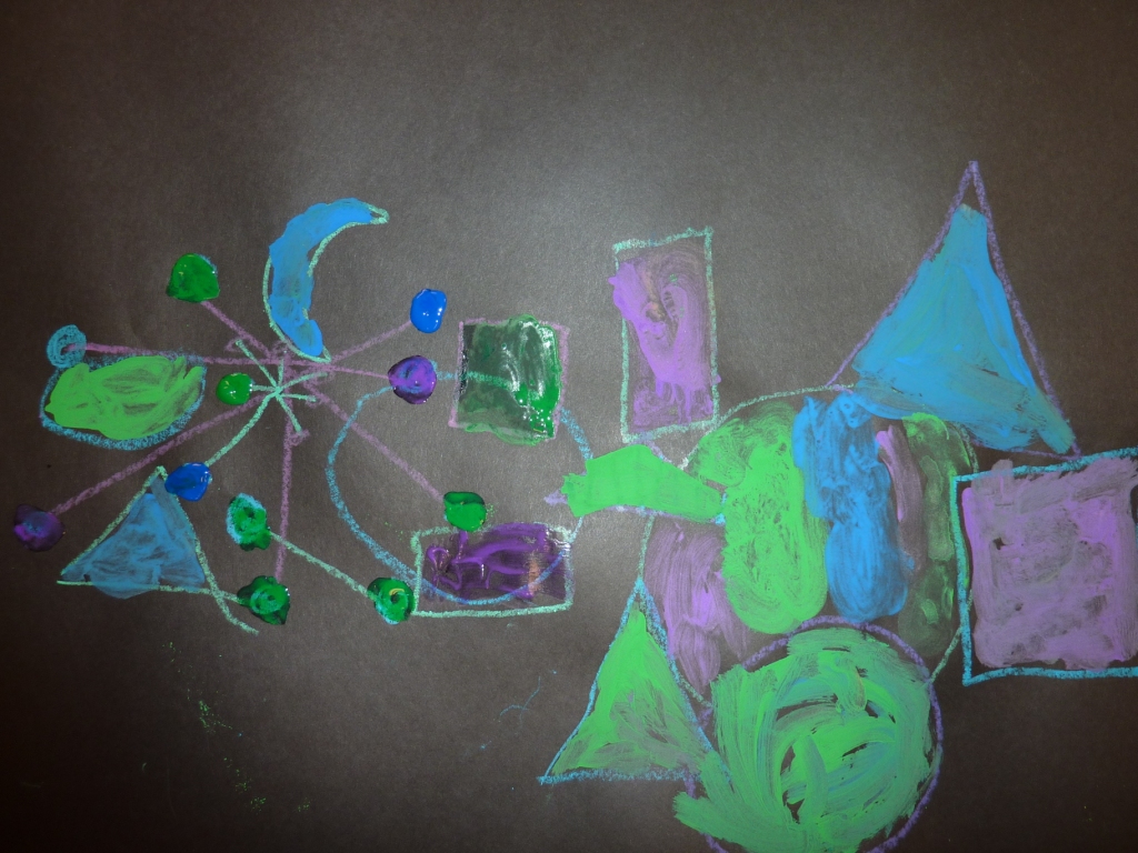
This year, in keeping with the idea of choices, I used the same basic premise, however, I moved away from portraits, since we had already done a portrait when we studied Picasso. This time we did an abstract composition, which was a completely new, but fun concept for them.
After looking at a variety of Miro's paintings, I created a poster with the basic shapes and lines that the students saw in his artwork.
They used this poster to create their own composition, drawing a variety of shapes and lines onto a piece of black paper, using construction paper crayons.
Then, I gave them 3 choices for adding color: oil pastels, color sticks and tempera paint. The stipulation was that they had to choose something that they had NOT used on their Picasso.
They continued with the warm and cool color scheme and colored their entire piece. Pin It
After looking at a variety of Miro's paintings, I created a poster with the basic shapes and lines that the students saw in his artwork.
Then, I gave them 3 choices for adding color: oil pastels, color sticks and tempera paint. The stipulation was that they had to choose something that they had NOT used on their Picasso.
They continued with the warm and cool color scheme and colored their entire piece. Pin It
Labels:
color stix,
cool colors,
first grade,
Joan Miro,
oil pastels,
tempera,
warm colors
Kinder O'Keeffe Flowers
This is an adaptation of the project that I did with my kindergarten students last year.
Last year's projects: Kindergarten Georgia O'Keeffe
This year:
I decided to cut the paper in half this year and gave each student a 9 x 12" piece of watercolor paper. The size was much more manageable for painting.

When the flowers were dry, I gave each student a template to trace onto the back of their flower. We learned how to hold our scissors and they cut the general shape of a flower from their painting.
I had them glue these onto a piece of black paper.
They added details to their flower with crayons (I think I need to go back to using oil pastels for this part- the crayons did not show up as well as I would have like them to).
Then I gave the students 2 small pieces of green paper and showed them how to cut them into the shape of a leaf.
They glued these on ("just a dot, not a lot") and here are our finished products. Again, thanks to Mr. E for the inspiration on this one!
Pin It
Last year's projects: Kindergarten Georgia O'Keeffe
This year:
I decided to cut the paper in half this year and gave each student a 9 x 12" piece of watercolor paper. The size was much more manageable for painting.
I had them glue these onto a piece of black paper.
Then I gave the students 2 small pieces of green paper and showed them how to cut them into the shape of a leaf.
Pin It
Labels:
cool colors,
Kindergarten,
O'Keeffe,
tempera,
Through Georgia's Eyes,
warm colors
Thursday, October 18, 2012
First Grade Picasso
First grade did this project last year, however, this year, I have adapted it. Our district is really working towards varied outcomes this year, so I am trying to give the students more choices in their projects. This is easier on some projects than others.
Here is how I did it for this particular project:
Last year, everyone did a watercolor Picasso project:
First Grade Picasso
This year, everyone drew a Picasso portrait. They all chose their color scheme (warm or cool) and then I gave them 3 choice for how they could add color:
liquid watercolor
Crayola Color Sticks
oil pastels
They followed their color scheme to color their entire project. Here are some of the results:
Pin It
Here is how I did it for this particular project:
Last year, everyone did a watercolor Picasso project:
First Grade Picasso
This year, everyone drew a Picasso portrait. They all chose their color scheme (warm or cool) and then I gave them 3 choice for how they could add color:
liquid watercolor
Crayola Color Sticks
oil pastels
They followed their color scheme to color their entire project. Here are some of the results:
Pin It
Labels:
color stix,
cool colors,
first grade,
liquid watercolor,
oil pastels,
Picasso,
warm colors
Kinder Jasper Johns
This was a project that I did last year with my kindergarten students. I changed it up a little bit this year.
Here are the results from last year:
Kindergarten Jasper Johns

We started out the same way, by coloring our paper using either a warm or cool color scheme. This year, I did cut the paper in half (I found that the large paper for my kinders at the beginning of the year was quite daunting!).
This year, I stayed with the numbers and letters, however I used our school's die cut machine and cut out what the students would need for the project.
I placed each one into a basket and had numbers on one side of the room (in 8 different baskets) and letters on the other side of the room (in 8 different baskets). I had the baskets color coded so that the students would know the difference between the numbers and letters.
I demonstrated how I wanted them to get 1 piece at a time and use 4 small drops of glue ("just a dot, not a lot!") on their number/letter and place it on their paper. Then they could get up and walk (again, demonstrating the correct and incorrect way to do this- the sillier I was in the demonstration, the better they understood it) to get another piece.
For the finishing touch, they used a black marker and added patterns to each square. Since they are working on patterns in their classrooms, they had fun with this! Pin It
Here are the results from last year:
Kindergarten Jasper Johns
We started out the same way, by coloring our paper using either a warm or cool color scheme. This year, I did cut the paper in half (I found that the large paper for my kinders at the beginning of the year was quite daunting!).
This year, I stayed with the numbers and letters, however I used our school's die cut machine and cut out what the students would need for the project.
I demonstrated how I wanted them to get 1 piece at a time and use 4 small drops of glue ("just a dot, not a lot!") on their number/letter and place it on their paper. Then they could get up and walk (again, demonstrating the correct and incorrect way to do this- the sillier I was in the demonstration, the better they understood it) to get another piece.
For the finishing touch, they used a black marker and added patterns to each square. Since they are working on patterns in their classrooms, they had fun with this! Pin It
Labels:
alphabet,
cool colors,
Jasper Johns,
Kindergarten,
numbers,
pattern,
warm colors
Monday, June 25, 2012
First Grade Klimt Trees
I originally found this lesson in the November 2010 issue of Arts and Activities magazine. It was written for upper elementary students and I adapted it to work for my first graders.
We started out by creating our background paper, using a wet-on-wet technique with liquid watercolors. The students chose whether they wanted warm or cool colors. They used spray bottles to spray their papers with water and then dipped their brushes into the paint and dab it onto their paper.
Then we looked at Klimt's "Tree of Life" and discussed the different lines and patterns that the students saw. I gave each child a 6 x 8 piece of Styrofoam and had them draw a tree on it. They started with their trunk and then I demonstrated how they could build their branches using spiral lines. I asked them to make sure their branches touched the top and both sides so that they had
a full tree, not a tree that just went straight up into the air. Then I had them fill in their trunk with a pattern of their choice.
Then I set up a printing station. While students were working on their Styrofoam, I had those that were finished, come over to me and they rolled black ink onto their Styrofoam, making sure to cover the entire piece.
Then they placed it in the middle of their painted background and used a clean brayer to press the Styrofoam and ink onto the paper.
I love the contrast of the black ink against the painted backgrounds!
Pin It
We started out by creating our background paper, using a wet-on-wet technique with liquid watercolors. The students chose whether they wanted warm or cool colors. They used spray bottles to spray their papers with water and then dipped their brushes into the paint and dab it onto their paper.
Then we looked at Klimt's "Tree of Life" and discussed the different lines and patterns that the students saw. I gave each child a 6 x 8 piece of Styrofoam and had them draw a tree on it. They started with their trunk and then I demonstrated how they could build their branches using spiral lines. I asked them to make sure their branches touched the top and both sides so that they had
a full tree, not a tree that just went straight up into the air. Then I had them fill in their trunk with a pattern of their choice.
Then I set up a printing station. While students were working on their Styrofoam, I had those that were finished, come over to me and they rolled black ink onto their Styrofoam, making sure to cover the entire piece.
Then they placed it in the middle of their painted background and used a clean brayer to press the Styrofoam and ink onto the paper.
I love the contrast of the black ink against the painted backgrounds!
Pin It
Labels:
cool colors,
first grade,
Klimt,
line,
liquid watercolor,
printmaking,
Tree of Life,
warm colors,
wet-on-wet
Sunday, November 6, 2011
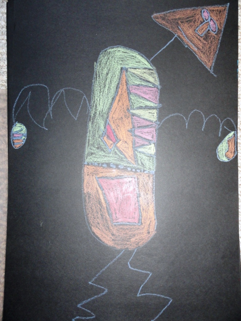
First Grade Joan Miro Portraits
I first saw this lesson on Deep Space Sparkle and decided to adapt it for my first graders who have been learning about lines, shapes and warm/cool colors.
We looked at a variety of different Joan Miro paintings, focusing in on what shapes and lines they saw in his artwork. I found a good sampling of Joan Miro artwork in a YouTube video and the kids ended up playing a game of "I Spy" searching out all of the lines and shapes.
Then we brainstormed 2 different lists: lines and shapes.
From there, I did a sample drawing showing how we could make the body out of any shape that they wanted to use.
They used 1 line for the neck, 1 line for the arms and another line for the legs, then added a different shape for head, hands and feet.
From there, I had them draw 2 shapes inside the body (trying to use a shape that they had not used previously). 2 lines were then used and I told them that the lines had to go through the shapes.
They added 1 line in each of the hands and feet.
When they were ready to color, we reviewed warm/cool colors and they then had to color each individual section a different color, never letting the same color touch.
Pin It
We looked at a variety of different Joan Miro paintings, focusing in on what shapes and lines they saw in his artwork. I found a good sampling of Joan Miro artwork in a YouTube video and the kids ended up playing a game of "I Spy" searching out all of the lines and shapes.
Then we brainstormed 2 different lists: lines and shapes.
From there, I did a sample drawing showing how we could make the body out of any shape that they wanted to use.
They used 1 line for the neck, 1 line for the arms and another line for the legs, then added a different shape for head, hands and feet.
From there, I had them draw 2 shapes inside the body (trying to use a shape that they had not used previously). 2 lines were then used and I told them that the lines had to go through the shapes.
They added 1 line in each of the hands and feet.
When they were ready to color, we reviewed warm/cool colors and they then had to color each individual section a different color, never letting the same color touch.
Pin It
Labels:
construction paper crayons,
cool colors,
first grade,
Joan Miro,
line,
shapes,
warm colors
Saturday, October 15, 2011
Kindergarten Jasper Johns
Kindergarten is learning about American artists this year. Our first artist was Jasper Johns.
When they were finished coloring, I gave them a black oil pastel and they used this to retraced all of their letters/numbers and the lines.
Then we reviewed the lines that we had learned earlier in the year and they were able to use ANY color (Yea!!) to create a lines in each box.
I have to say, I am really happy with how well they colored these. Usually, I have a bunch that get tired of coloring after about 3 minutes and don't want to continue. This year, they worked on this so hard and the colors turned out really well!
Pin It
Labels:
cool colors,
Jasper Johns,
Kindergarten,
letters,
line,
numbers,
oil pastels,
warm colors
Subscribe to:
Posts (Atom)