Showing posts with label color stix. Show all posts

Thursday, November 6, 2014

Fifth Grade Kandinsky Musical Compositions

The first project that I had 5th grade work on this year was music inspired. The students learned about the artist Wassily Kandinsky and how he was influenced by music. We combined both of these topics and the students chose a musical instrument (I had a LOT of guitars, unfortunately) and drew it on a piece of construction paper. I encouraged them to draw it large enough so that the instrument would go off of the page.


They filled in the background using shapes that were inspired by Kandinsky artworks.

The students were given the choice of using crayons, color sticks, oil pastels or markers to color their composition in 1 color scheme (primary, secondary, complementary- a review from previous years). Some of them chose to use a combination of all of these.

I had old music books handy and the students were able to add ripped up pages of sheet music onto their background.


Pin It

Tuesday, February 4, 2014

Kinder Jasper Johns

This is a project that I have done before with kindergarten, however, in keeping with giving the students more choices and teaching them to make artistic choices for themselves, I had 3 versions of this project going at one time.

The first project started out by using tempera paint (in either warm or cool colors) to paint a folded piece of paper. Once the painting was done, they used oil pastels in the opposite color scheme to create lines in each box (wavy, zig zag, dotted, straight, etc). Then I had the letters A-H that they traced onto construction paper. They cut them out and glued them in order.


The second project used color sticks to color their paper. They used markers to create their lines and then they glue die cut letters on each square.


The third version of this project used oil pastels to color their paper, tempera paint to create their lines and then glue die cut numbers in each square.


Pin It

Wednesday, October 2, 2013

1st Grade Picasso's

I had such success with the first grade Picasso's last year, that I did not change the project for this year.

We looked at a variety of portraits painted by Picasso and then drew our own. The students were allowed to choose if they wanted to use liquid watercolor, oil pastels or Crayola Color Sticks.

See last year's post for more info: 2012 Picasso Portraits

Here are examples of this year's finished products:


Pin It

Saturday, November 24, 2012

First Grade Joan Miro's

Here are the projects that my students did last year: Joan Miro Portraits

This year, in keeping with the idea of choices, I used the same basic premise, however, I moved away from portraits, since we had already done a portrait when we studied Picasso. This time we did an abstract composition, which was a completely new, but fun concept for them.

After looking at a variety of Miro's paintings, I created a poster with the basic shapes and lines that the students saw in his artwork.

They used this poster to create their own composition, drawing a variety of shapes and lines onto a piece of black paper, using construction paper crayons.

Then, I gave them 3 choices for adding color: oil pastels, color sticks and tempera paint. The stipulation was that they had to choose something that they had NOT used on their Picasso.


They continued with the warm and cool color scheme and colored their entire piece. Pin It

Thursday, October 18, 2012

Fifth Grade Mandalas

I have done this mandala lesson for a couple of years, but have adapted it this year to allow the students some choice in their final product.

Here are some examples from previous years:

Fifth Grade Mandalas

I start out by showing the students this PowerPoint I found:


The students then had to plan their project in their sketchbooks. I had them decide on which project they wanted to do:

folded paper (to create 8 sections)
folded paper with a CD in the middle
print
hexagon

They had to decide if they were going to use geometric or organic shapes for their design and then which color scheme they wanted to use: primary, secondary, complementary or monochromatic.

While they were working on their plans, I began meeting with each group and helped them get started with the initial steps in their projects- folding paper, using compasses, dividing up their Styrofoam for their prints, etc.

As the project progressed, I met with the different groups to discuss their next step. How they needed to add color- using markers, Color Sticks, crayons, ink, etc.; how to build their hexagon, etc.

The students seemed to really enjoy that their projects had the chance of being completely different than everyone else in the class. I am really hoping that as we go along, they will start to think outside of the box and present ideas to me as to what they would like to do.


Pin It

First Grade Picasso

First grade did this project last year, however, this year, I have adapted it. Our district is really working towards varied outcomes this year, so I am trying to give the students more choices in their projects. This is easier on some projects than others.

Here is how I did it for this particular project:

Last year, everyone did a watercolor Picasso project:
First Grade Picasso

This year, everyone drew a Picasso portrait. They all chose their color scheme (warm or cool) and then I gave them 3 choice for how they could add color:

liquid watercolor
Crayola Color Sticks
oil pastels

They followed their color scheme to color their entire project. Here are some of the results:


Pin It

Monday, June 25, 2012

Fifth Grade Mandalas

Last year's mandalas: Mandalas 2011

This year:

Pin It

Friday, January 20, 2012

Fifth Grade Pagodas


This is an idea I got from the teacher resource Thinking With a Line. I have used the printing ideas previously, but only with PreKinder, Kinder and 1st. I decided to try an activity on architecture with my fifth graders. Since fifth grade is learning about Asia, we focused on pagodas.


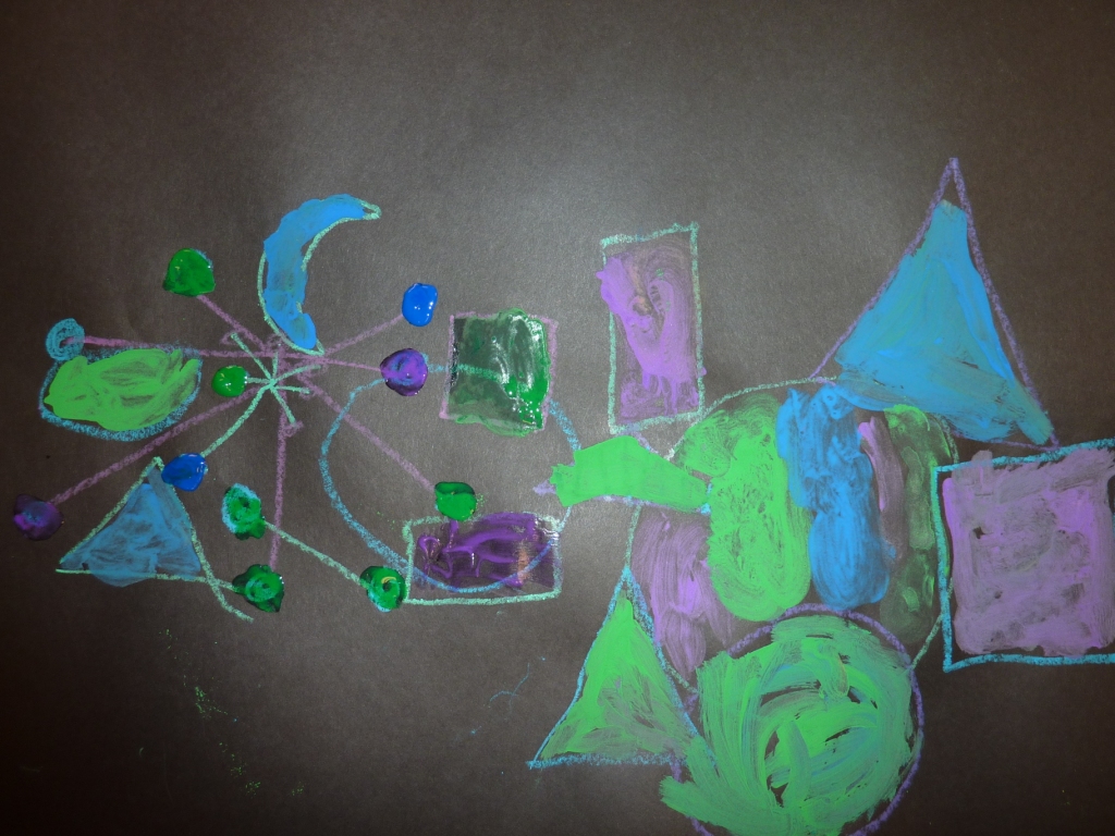
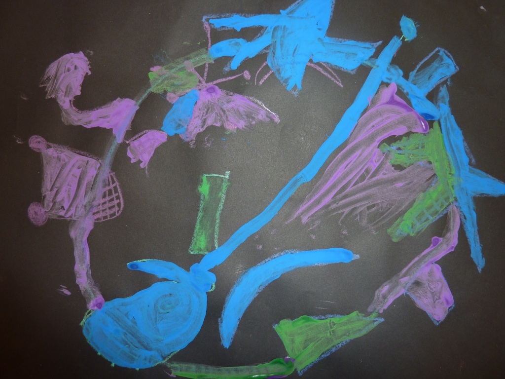
We looked at different examples, the lines that were used in them and I had them plan out their building in their sketchbook.

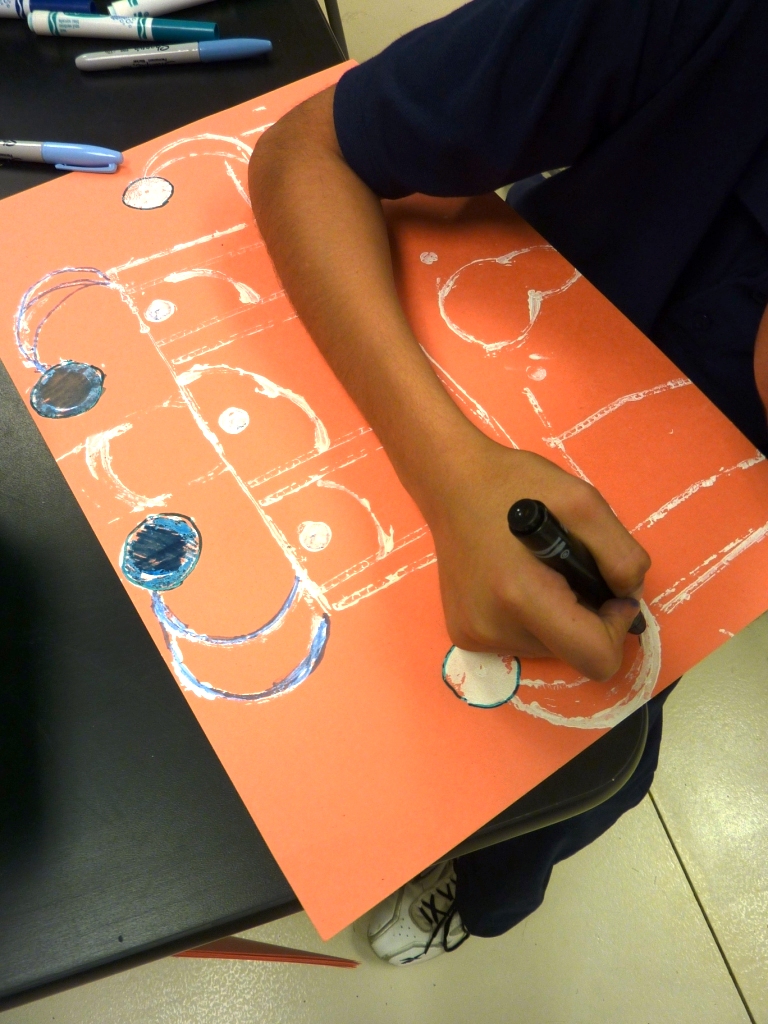
Then I gave each table a basket of printing tools: corrugated cardboard, 1/2 circles (tape rolls that I cut in 1/2), blocks, marker caps, bottle caps, pretty much anything that I thought might make an interesting print.


Each student picked a piece of construction paper and began building their pagoda using white acrylic paint- this was a change for them, since they are used to using black as their outline for everything.

The next week, we discussed color schemes. We reviewed old ones (warm, cool, primary, secondary, complementary, monochromatic) and I threw in a new one (analogous). They had to choose 1 color scheme for their entire pagoda. I gave them a basket with a variety of materials: tempera cakes, watercolors, Sharpies, watercolor markers, color stix, oil pastels. They could use as many as they wanted, as long as they stuck with their scheme.

I was very impressed with the results!


Pin It